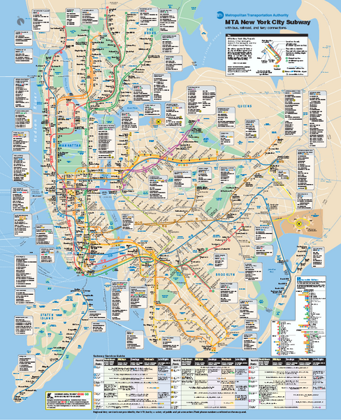
The MTA is unveiling a new subway map for New York.
The present map was released first in 1979 and although additions have been made, it was felt a that the city needed an update. There have been complaints that the map was difficult to read and an alternative version was available at Kick Map.
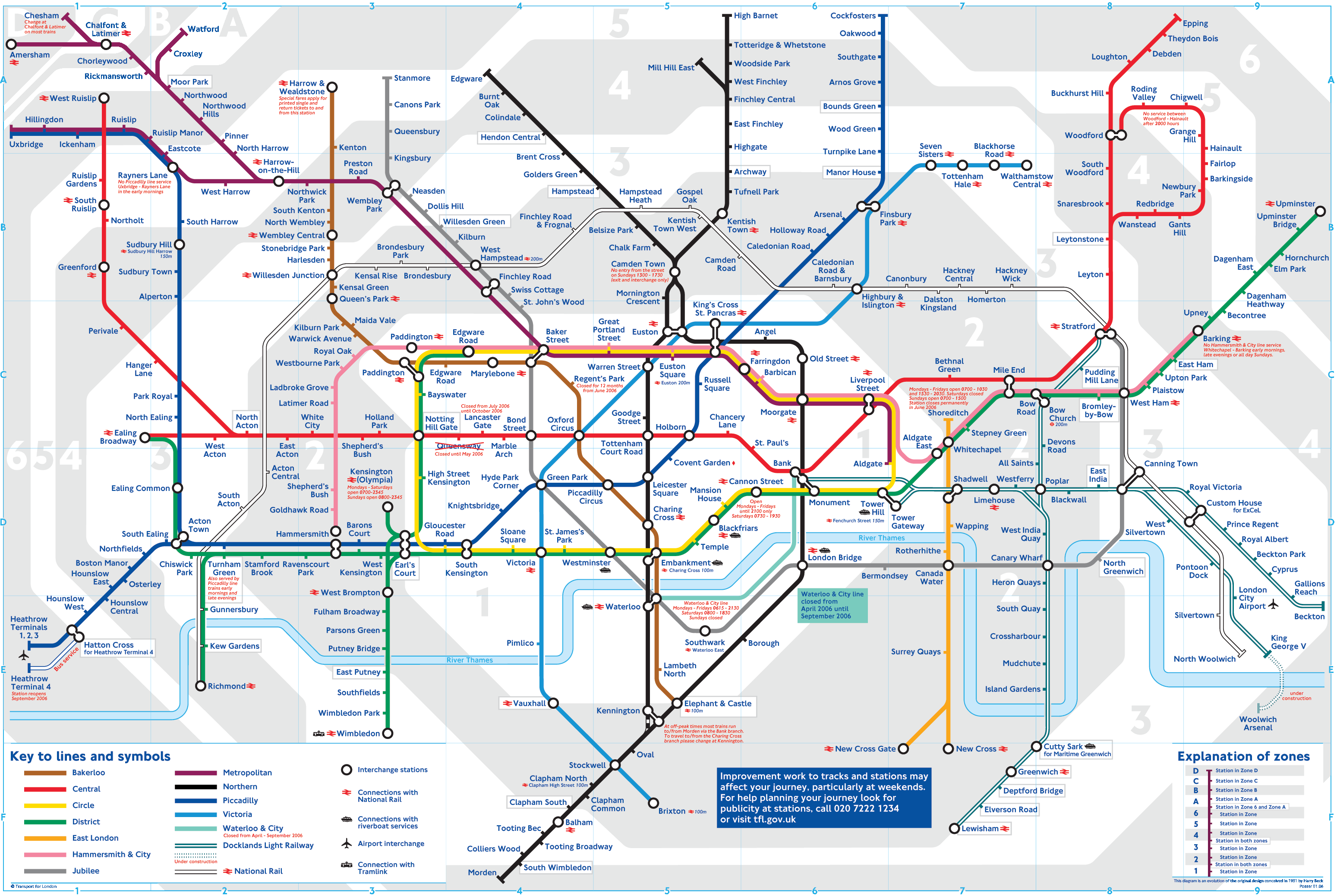
The biggest challenge in making any map for a Metro is what extra information to include apart from the train stations themselves. The London Underground Map is the most famous example of an abstract design that has no relation to the city geography and yet it has worked well.
New York used to have a similar map in 1972 but New Yorkers did not understand how to use it and got confused. So it was replaced with a map in 1979 which had neighborhood names & landmarks. But as time went by more subway lines were added and other information such as bus routes and ferry lines made it difficult reading. Hopefully the latest map would solve this problem.
The Delhi Metro Map has been continuously evolving but the map itself needs a lot of work in simplifying information. On the Metro website one can hardly read out the stations. The first rule of maps which is that it should be easy to read has been ignored. Hopefully the map will see better days in the future.
Funnily enough the new map would have a 30 percent larger Manhattan Island to accommodate the several lines criss crossing the island. Wonder how geography enthusiasts and map lovers would react to a New York with a larger island in the centre ?
No comments:
Post a Comment